Besides the amazing food, the hotel is the epitome of modern chic. Everything from the neon lights above the elevator to the abstract fountain screamed luxe. Obviously, I couldn't NOT capture these elements so I uploaded a couple of PHHHOTO's.

Although nothing was exactly similar in the hotel, it all came together and followed the same contemporary theme and I was all for it. This was what brought me to decide on a contemporary yet eccentric theme; something never done before in the world of fashion.
As soon as I got home, I created two main sketches for the cover page, including two different mastheads. I don't know whether I want a title thats iconic and only one word, such as APEX or something more casual and quirky like The Frow. I also jotted down some general notes for colors and some pros and cons to the different layouts.
I also went back to my Pinterest page and pinned some of the really helpful articles I've been reading about how to make the cover page stand out. My favorite has to be Canva blog post by Rebecca Gross, in which she studies 50 of the best design techniques known to print history. Tip #1 is to make the issue title overlay the cover image, but what I love most about the Little White Lie's cover is that the cover title never seems to make the image less important and it adds a lot of dimension to the cover.
So far, I'm chuffed with how I've managed to dedicate an entire hour each day to researching, planning, and sketching. The next step is to start playing around with different design programs and find which one is best for me. And this is my cue to sign off because the pizza delivery guy has just rang the door bell!xx
-EMC
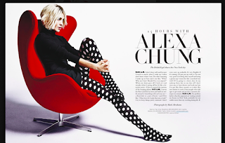
Also, check out this incredible two-page layout Alexa Chung did with Harpers Bazaar. Not only is the layout unique in the sense that the article follows the outline of her image, but the concept of a '24 hours with...' is extremely cool and I don't think it's ever been done before. I think this is the kind of route I want to go for my possible interviewer with my designer.
So far, I'm chuffed with how I've managed to dedicate an entire hour each day to researching, planning, and sketching. The next step is to start playing around with different design programs and find which one is best for me. And this is my cue to sign off because the pizza delivery guy has just rang the door bell!xx
-EMC


No comments:
Post a Comment